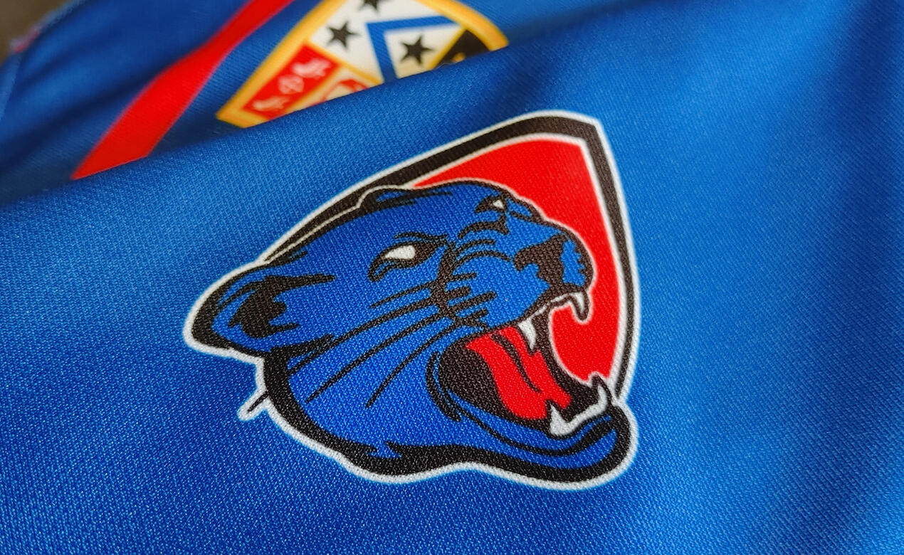
Chris Chong is the highly qualified, experienced, and dedicated graphic designer at SMUS, working every day on the fourth floor of School House. Many of his projects over 15 plus years working with the school have included marketing materials like creation of the Viewbook(s), annual Report Cards, School Ties magazine, Annual Fund campaign materials, Graduation Ceremony programs and photographing events on campus. This year he took on an additional project at the school: creating a new Jag logo for athletics.
While it’s not the first logo he’s created for a brand in his career, it is the first time SMUS has seen a logo change since the Jag was first introduced around 2003 (original design by Head of Art, Chris Bateman). We sat down with Chris Chong to get some insight on this process.
How do you go about updating and refreshing a familiar logo?
Speaking about branding in general, I find things that I like and don’t like about the organization's branding, what’s been successful about the logo, and how well-loved it is. When you’ve been around and worked with identities for as long as I have, there’s a part of you that can kind of immediately pick out what works and what doesn’t, in any sort of brand. I guess it’s really the one time I allow myself to get quite critical. However, I had to be sensitive about the history and pride attached to the old Jag logo.
What direction did senior leadership at the school give you?
With this Jag logo, I had to consult with the client/key stakeholders in the school. The worst thing a graphic designer can do is go off in their own direction, put a lot of work into something, and realize that it was in the completely wrong direction. It’s important to get an initial impression, and then see where the client wants to take this. So we had several meetings to get a sense of what’s already out there (with similar brands), the different possible directions we could go, and what we want the overall look and feel to be. Throughout the project, I kept returning to the key stakeholders for approval on certain design milestones to make sure I kept on track.
How did you decide what the new Jag logo would look like?
I wanted to bring it in line with contemporary graphic design practices; getting rid of the very sharp lines on the previous logo, the aggressiveness and pointy teeth, red eyes, and so on. We looked at what other high schools and institutions of our calibre were doing, and many sports teams use big cats, but you also don’t want to unknowingly mimic another team. Using photos of a single real jaguar as reference helped make the design unique because that cat was unique. I wanted to make sure I captured distinctly jaguar features, as opposed to a leopard, or a panther. Keeping the school colours was easy, but there were lots of different ways to incorporate the crest in a contemporary way. The shield element was stylized in a way that honoured the school crest, but still worked with the aesthetic of the logo. There were a lot of logistics that went into making sure the Jag could fit on all the different sports teams’ attire, different sizes, but still look cohesive.
What does it mean to you, to create the new Jag?
I had a lot of fun. It was a challenging but enjoyable process, and I feel pretty honoured to actually add to the history of the school. I want to give a shoutout to Chris Bateman, whose original Jag logo design lasted a couple of decades. Moving forward now, we’re going to apply the new Jag logo everywhere, and it’s really cool to actually see them on jerseys, displayed on screens around the school, and stuff like that. There’s been a lot of positive reception towards the logo so far, and I think the new Jag will help keep school spirit high and full of pride, and I’m grateful to be a part of that. Thank you!


